So-Cal dogs
have the simplest taste
They are always
satisfied with the best
The opportunity does not arise every day, so when we were asked to provide the strategic approach and the full range of communications services for a brand new company, we immediately set up the starting blocks. As money was somewhat tight and the time window was narrow, we put together a nimble, experienced core team: Ana Castro Carrancho, our specialist for logo design and brand identity, Andrea Keßler, our senior web designer, and Christian Göhrum, a web designer with specific knowledge of the Shopify e-commerce platform. The result: a classic study in branding.
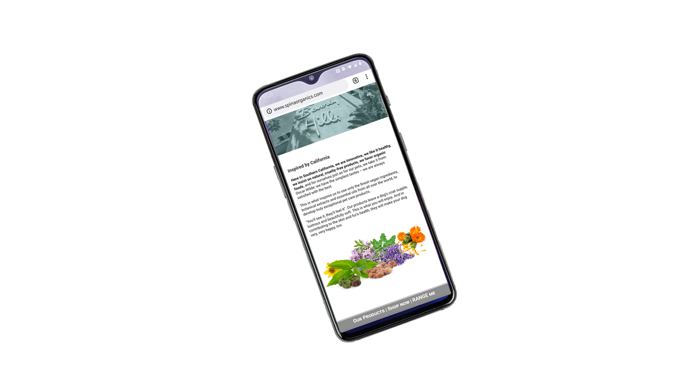
Website with integrated e-shop
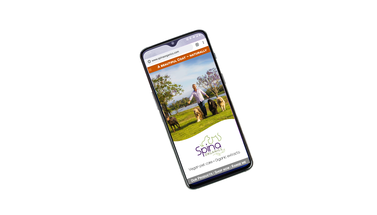
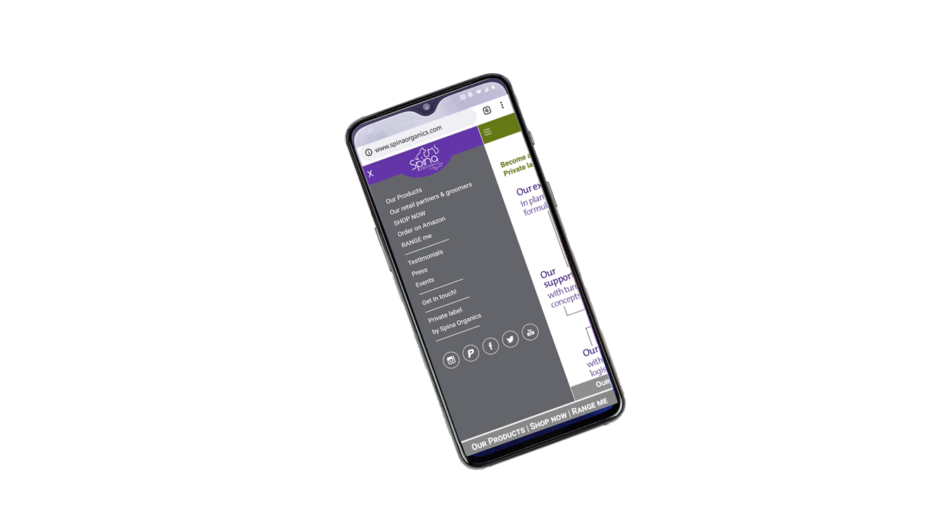
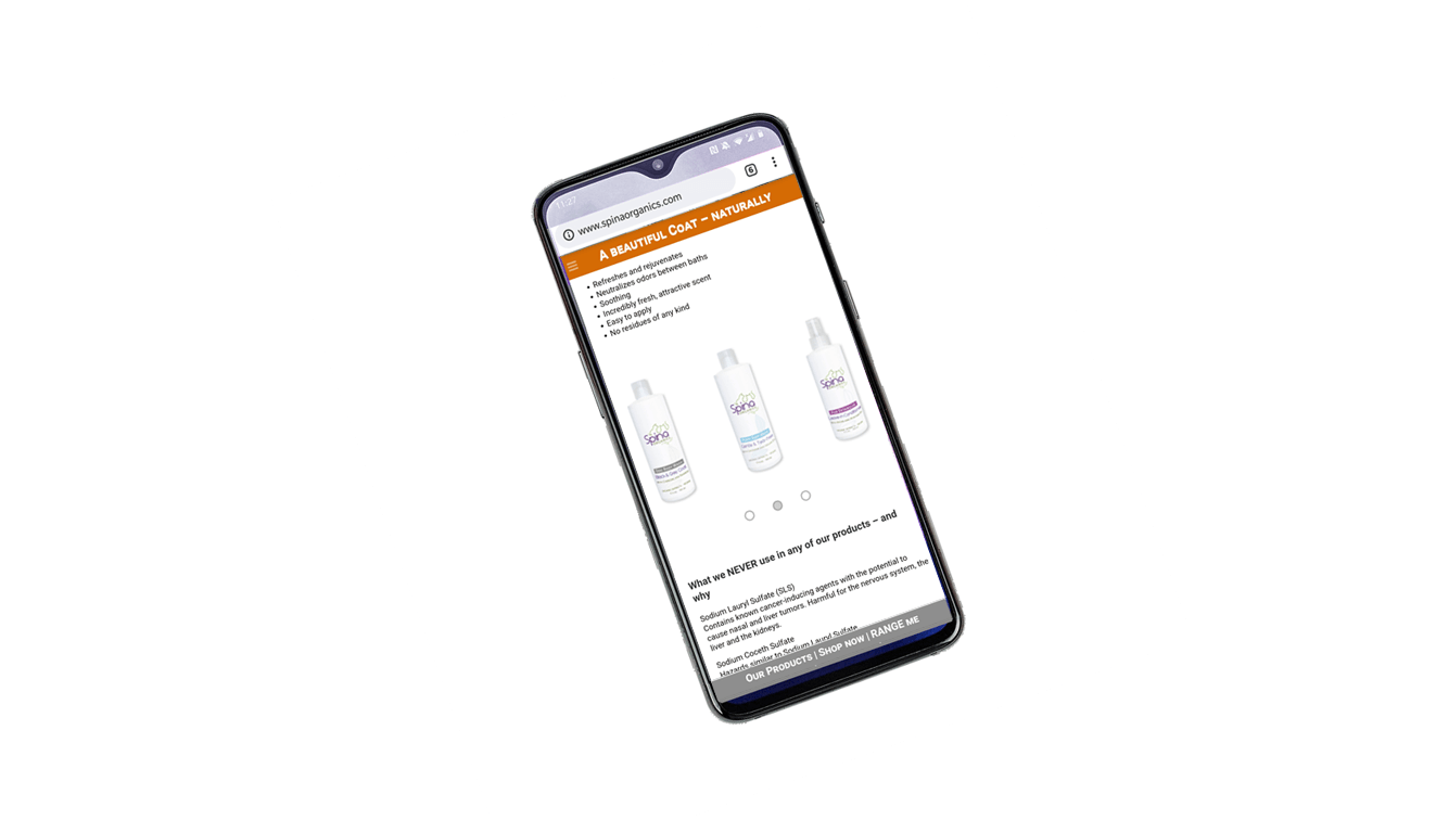
Considering the target group—with its focus on affluent, urban female buyers—we convinced the client to go ‘mobile-first’, with a website that would be visually and technically optimized for mobile phones, while still looking good on a laptop or desktop computer. The e-commerce function was integrated via the Shopify platform, in order to make the products available nationwide.
Packaging
No weird ingredients in the product itself, no weird elements in the graphic design of the bottles: here, the shelf appeal is based on elegant simplicity. Considering the brand’s philosophy, it would have been very wrong to resort to glossy finish, hot stamping, metallic inks, and an abundance of different typefaces.
The bottles reflect the purity and quality of Spina Organics’ shampoos and conditioners. Which is exactly what they should.
Trade show booth
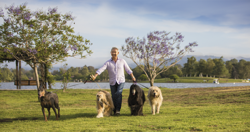
SuperZoo, the major trade show for pet products, is at the core of Spina Organics’ expansion strategy. With its 8’ x 20’ backlit ‘Lumiwall’, the 2018 corner booth was hard to miss. Here again, the emphasis was on clear lines and no clutter. So we opted for a single backdrop picture, stretching the only image where all four dogs looked great by almost 100%, while avoiding any quality loss. As Mauro Spina wanted to smile (he was frowning on the original photograph…), we did an additional full head transplant from another picture (without any Frankenstein effect). This result: a 1 GB (!), high resolution print file—and a composite image that ended up being used many more times.
Ads and promotions
Spina Organics is present in all major pet magazines, with a mix of ads and PR. As for the Travel Set, which was originally a limited, one-time edition, it has become a permanent, very popular item.
Private label promotion materials
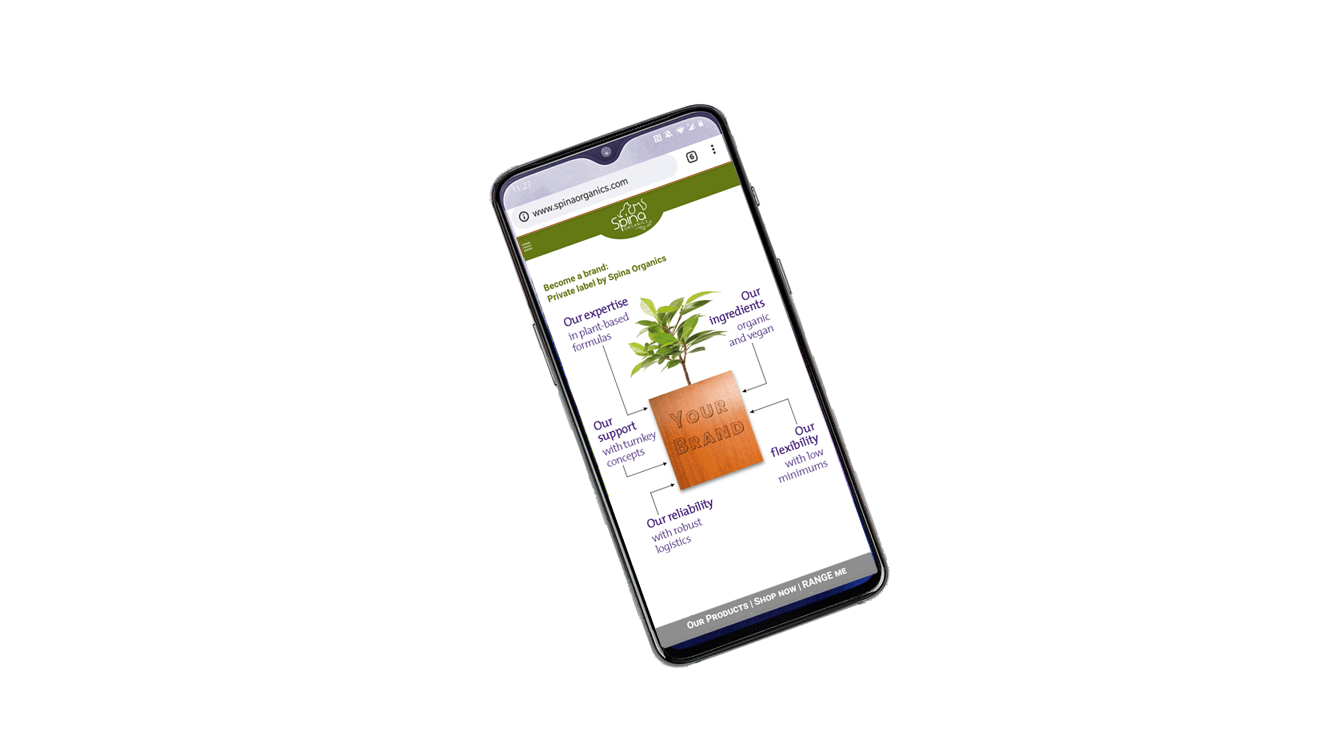
In the pet care industry, private labels are an intrinsic part of the business, as quite a few retailers are into own-brand product lines. With low minimums, Spina Organics can offer this service to independent groomers as well.
The Private Label displays and folders, while retaining some basic layout similarities, have been designed on purpose to display a style of their own—thus underscoring the differentiation in strategy, target group and packaging.
